Note: all left/rights are now correct.
I have had lots of mail about Japanese knitting symbols, and believe me, I wish there were a magic translation wand to wave over those-Oh-So-Beautiful-But-Incomprehensible pages in the Japanese knitting magazines. I am going to show you the most common symbols and instructions, but you, dear reader, are going to have to do a bit of study, too.
Unfortunately, Blogger creates blurry thumbnails of all my pretty pictures. I have to cut, paste, and annotate each one, which takes a lot of time (especially considering how feeble my Japanese is).
You can download a nice PDF copy of all these pictures here. You will have to join the Mountain Ash Yahoo group to download it.
For now, let's begin with the basics: Stitch, Knit, and Purl. As you can see from the image below, a Knit stitch is called a Front stitch in Japanese. And it should come as no surprise that a Purl stitch is called a Back stitch. Knit stitches are indicated in two ways: a vertical line in a box and an empty box.
The Purl stitch is a horizontal line, and this line carries over to other symbols as we shall see in a second. In general, if you see a horizontal line under a symbol, it means "Do Something Purlwise."
Let's proceed to decreases. Notice that the Purl 2 together--left slant symbol has a line under it.
And, of course, the right-slanting single decreases look similar. Here are the triple decrease symbols--and they should be no surprise at this point. One more kanji for you here: Center or Middle. It's actually quite logical-looking and you will see it on patterns to indicate a central pivot stitch, as well.

And some miscellaneous stitch symbols:

Here is a small, annotated lace pattern. It's a composite, so don't bother knitting it. I am just showing you the kanji translation.
And finally, because my brain has now turned into a salted pretzel, I present a loose translation of the verbiage stuff that you will see at the beginning of a pattern.
Bear in mind that there are zillions more symbols--twist stitches, cables, fancy binding stitches. But this post covers all the stitches you will need to do Mondnacht, Mountain Ash, and most other Japanese lace patterns.
Do let me know if this information is clear and useful. If there are other symbols you want explained, let me know that also. Thanks!
Tuesday, January 30, 2007
Japanese Knitting Symbol Primer
Posted by
fleegle
at
9:52 AM
27
comments
![]()
Labels: japanese symbols, Knitting
Saturday, January 27, 2007
Designated Penguin III

I rise to the challenge.
Today I did two cast-ons. The first one is for Mondnacht--a stunning scarf from New Style of Heirloom Knitting. As far as I tell, the New Style involves wickedly complex garments knitted with bizarre construction techniques, such as short-rowing to shape Shetland shawls. And all these fun ideas are carefully wrapped in a teeny-tiny kanji font, just in case you thought you had a clue.
Information about ordering the book with this pattern can be found here. It's in the book with the Mountain Ash shawl, for those who might be contemplating knittiing the latter.
Stunning, isn't it? I cast on the required 100 stitches on a #3 needle using Zephyr--about half the weight of the original yarn (which I calculated to be about 2200 yards/pound). Here, for posterity, are the first three rows.
For those of you not familiar with Hazel Carter's Spider Queen shawl, I present this slightly Photoshopped image, which represents what the shawl should look like when I have woven in the last loose end, broken open the champagne, and retired to the Possibly Happy Home for Lunatic Knitters.
Here we have 179 stitches an a #2 needle for the center of the Black Widow Spider Queen shawl. I am using the Gentle yarn described in an earlier post. It's 5% cashmere, 95% merino, and soft as a cloud. The yarn was shorn from Elmer here, who is posing with his late hair.
Here's an interesting comparison between the two cast-ons. Notice how much thicker the Zephyr looks compared to Gentle. There are three rows of the Zephyr knitted up, but the row lengths almost the same. Scary, isn't it?
You probably won't hear about these two projects until I finish the Dragone. I will start chart 4 tomorrow, so it won't be that much longer until you can lift your coffee cup, breathe a big sigh of relief, and say to yourself "Better her than me."
Posted by
fleegle
at
2:35 PM
12
comments
![]()
Labels: Black Widow Spider Queen shawl, Knitting, lace, Mondnacht
Friday, January 26, 2007
Black Diamond Head Lamp

Several people have reminded me that good lighting is essential for knitting dark yarn. Yes. Well. My husband took one look at me fondling that black Gentle yarn, scampered to REI, and purchased the best headlamp he could find.
Complete with dorky headstrap and battery pack, this baby could stun an entire herd of moose. It is actually three lights in one--a central spotlight and two slightly less formidable side lights.

They are all LEDs, by the way, so the battery life is pretty good and your head won't cook after you've worn it for a while. There are several brightness settings, too. Oh yes, it has a strobe setting, which I envision using as a signal for more cookies or something.
Comes in green and silver and uses 3 AA batteries. It's called the Black Diamond Icon. On it's lowest setting, it provides 164 hours of light; on the highest setting, 70 hours.
Posted by
fleegle
at
6:03 PM
6
comments
![]()
Labels: tools
Me? The Designated Penguin?


So much positive response to the Black Widows Spider Queen! But as I was clicking my needles together in anticipation and basking in the admiration of my fellow lace knitters, my husband reminded me about The Designated Penguin.
Penguins aren't stupid, well, not really really stupid. Not as stupid, say, as someone who wants to knit an incredibly complex shawl with black frog hair.
When penguins want to go take a swim, instead of everyone jumping enthusastically into the water, they crowd around the edge of the ice and push one of the flock (pride? group? tuxedo?) into the water. If The Designated Penguin doesn't get eaten by a passing seal, well, great! The water's safe and they all jump in for a swim.
Um, anyone out there feeling sort of black and white and feathery?
Posted by
fleegle
at
5:52 PM
2
comments
![]()
Black Widow Spider Queen shawl?
Every so often, I get an idea that just won't let go of my brain. And the idea of knitting Hazel Carter's Spider Queen shawl in black has been ebbing and flowing inside my knitting neurons for a week or so. Frankly, when the idea occured to me, I decided it was completely insane. So I grabbed some #2 needles and a ball of Gentle from the Yarn Place and made a swatch. The yarn is quite pleasant to use--springy and soft. And really, really thin. And really really black.
I so love it. Sigh. What do you think?
Posted by
fleegle
at
9:10 AM
6
comments
![]()
Labels: Knitting, lace, Spider Queen
Estonian Lace Swatches
These pretty little swatches are from the Estonian lace book Pitsilised Koekirjad (ISBN 9985-54-016-6), described here. They are samples for a possible reprint. Notice the middle one's nupps--a hefty P8tog. Perfectly easy if you use this technique. Knitted in white Zephyr with #3 needles.


Posted by
fleegle
at
8:55 AM
4
comments
![]()
Thursday, January 25, 2007
Sock Interlude

This pair (there is mate to this one, really!) was knitted in feather and fan pattern using Handmaiden Silk/Cashmere Rose Garden on #0 needles. The pattern is my own toe-up, no-hassle sock. You can find the pattern here. I used a crocheted bind-off as an experiment. Meh.
Posted by
fleegle
at
10:24 AM
5
comments
![]()
Heere Be Dragones Journal--Row 211

This morning, I knitted the first row of his chin. There is definite progress, as evidenced by the fact that the entire piece won't fit into the picture frame anymore without zooming way out. And two people are needed to hold it up for a photo. Alas, only one of us was available this morning, so you can only see a cropped view of dragone's middle. Nice tummy! I loved that part!
If you are contemplating knitting this piece, think a little thicker, than thinner yarn. Half the beauty of the design are the textural stitches. In fine yarn, these disappear. I saw one the other day knitted in white yarn. It was exquisitely done in very fine wool, but it it didn't show the lacy or relief textures that a thicker yarn would show offf to better effect.
And, I know this sounds a bit nuts, but really, it gets way easier! Somewhere in the middle of the wings you will zone into auto-pilot. Clear sailing from there.
I am now swatching for an alternative border. I didn't care for the original version, so I am looking at dragon-scaly patterns. Suggestions are welcome!
Posted by
fleegle
at
10:13 AM
7
comments
![]()
Labels: Heere Be Dragones Shawl, Knitting, lace
Tuesday, January 23, 2007
Charting Software Part III: KnitPro 2.0
Yeah, I know. I promised a review of PC Stitch in the last post. I don't like PC Stitch much, for reasons I will explain when I do review it. I actually have part of the review finished. I wandered off in the middle, realizing that not a single person has begged me for a review of PC Stitch, so it's not like I am going to cause massive disappointment by delaying the inevitable.
So, In this episode, I shall take a look at KnitPro 2. It's just cool--a cute, free application whose sole purpose is to chart an image for knitting. Here's a screenshot of the web page. Instead of staring at this blurry image, click on the link and look at the Real Thing instead.
The application is simple enough for just about anyone. If you can find a file on your machine (or can ask someone else to find it), you will have a knittable chart in about two seconds.
KnitPro gives you a choice of square, 7:5 (landscape), and 5:7 (portrait) grids. Cross-stitchers would use the square grid; knitters should choose one of the two latter proportions, depending on whether your image is wider than long, or vice versa. You have three size choices too.

So, just upload your image, make your selections regarding size and grid ratio, and smile as KnitPro presents you with a nicely gridded image—all ready to go.
Here’s the original image…
And here’s the gridded result. The colors look weird because the picture was compressed for uploading. The real output is faithful to the original colors.
The image, by the way, should have a resolution less than, say, 150 dpi. I tried uploading a 300-dpi image, and KnitPro gave me an error. I downsampled the image to 150 dpi and everything went smoothly.
Next up is, um, PC Stitch. Unless you guys want me to look at something else first. Please.
Posted by
fleegle
at
11:18 AM
5
comments
![]()
Monday, January 22, 2007
Elegant Uses for Norwegian Purl
Norwegian Purl is a cute little maneuver that produces a purl stitch with the yarn in back of the work at all times. It's in common use in Denmark and Switzerland, and presumably Norway (although they don't eat French Fries in France, so maybe not).
Some people who have difficulty maintaining an even tension with normal purling find improvement using the Norwegian method.
I taught myself this technique a couple of years ago, but didn't find it particularly faster or more convenient except in the following circumstances:
1, If you are knitting with multiple needles (2 circs, 4 or 3 needles in the round) AND your new needle starts with a purl stitch, using the Norwegian Purl method on the first two purl stitches makes it very easy to tighten the stitch so you do not get a ladder there. This is because the yarn remains in back of the knitting in Norwegian Purl, making it much easier to tension with your forefinger.
2. Similarly, If you are plagued by loose purl stitches after cabling, a Norwegian Purl here will tighten things up.
3. And, in the same vein, when you purl after a yarnover and it just seems too loose, try a Norwegian Purl instead.
The video is here:
http://www.knittinghelp.com/knitting/basic_techniques/purl.php
I had to watch it a bazillion times before I got it, but it is a very useful technique to stuff in your bag of tricks. Give it a try.
Posted by
fleegle
at
11:00 AM
11
comments
![]()
Tuesday, January 16, 2007
Software for Knitters: Part III--Knit Visualizer Review
Knit Visualizer version 1.2
Platform: Mac and PC
Rating: 4 out of 5 stars

As you can see from the picture above (which will be far clearer if you click on it.These blurry Blogger thumbnails are just awful), the layout consists of the main chart window, a panel of stitch symbols on the right, a text entry field on the bottom, and an icon toolbar under the Main Menu bar on the top.
Here's a snip of the chart itself.
There are several ways to use the program. You can enter the chart symbols directly in Stitch Paint mode, or you can type in text and watch as Knit Visualizer miraculously translates these into a graph for you.
Here I am typing in Row 5…

And here’s what Knit Visualizer displays when I press the Enter key.

The program lets you specify whether your pattern should be set up for circular or flat knitting and whether the current entry is a right-side or wrong side row.

There’s a limit to the translator’s intelligence. It would be flummoxed by something like k2, drop the yarnover from the previous row, k2. You have to abide by some rules, which are clearly delineated in the manual, and be a bit creative when charting patterns with unusual stitches.
And you can select cells and add borders, if you need them.

The designer has included a broad range of symbols, including cables, twists, increases, decreases, and a set to indicate colors.

There are two drawbacks to the program. The first is the cost: $135 will buy a lot of sock yarn!
The second drawback, in my opinion, is the output format, which is currently limited to .png files (a bitmap format similar to .jpg or .tif). Thus, you cannot edit the result directly or change the symbol definitions. There are some tricks to editing both before and after output, some of which are only for graphics experts. I’ll try to explain what you can do, but some of the options will not be available to you unless you own other types of software.
The simplest way to make some changes is inside the Print Preview dialog box. Here, you can actually alter some of the text merely by typing it in. The first screen shot below shows the unedited pattern output.

And here I have added the text you see highlighted.

You can also enter in notes, as shown below, and actually change the pattern itself, if you are so inclined. Also, there are several layout variations you can choose—horizontal, vertical, vertical centered, and so on. I switched to the Horizontal layout in the picture below.

Some of the text cannot be changed, for example, the actual stitch definitions shown in boldface in the dialog box.
Here, I have opened the PostScript output in CorelDraw and have selected the line of text at the top.

Now I have increased the text size and changed the text color to red…

And changed the purl stitches to blue dots…

And made one of the gray boxes pink.
I gave Knit Visualizer a 4 out of 5 rating, withholding one star because it currently lacks color support and boy, on my laptop, the interface font is really tiny. I squint a lot reading the menus and command options.
If you hate written instructions and wish they would all turn into neat charts with a wave of a wand, Knit Visualizer is definitely worth the investment.
Stay tuned for the next installment of this treatise—PC Stitch.
Posted by
fleegle
at
3:15 PM
4
comments
![]()
Sunday, January 14, 2007
Heere Be Dragones Journal--Row 171

Here I am on Chart 3, row 171. You can start to see the bottom of the wings emerging. Dragone will start flying pretty soon!
Chart 2 went swimmingly until I hit row 155, at which point, a turtle with knitting needles could have purled rings around me. This row contains all sorts of goodies--twisted stitches, belly stitches, wing stitches, and horizontal stitches, all mixed into a wicked brew that defied the conventional use of markers.
For the floating twisted stitches, I devised a cute little method with some removable markers that I had never bothered with before. The markers go through the stitches, not between them. They act as micro-cable needles, because I could use them as handles to pull the floaters off the needles and reposition the stiches that need to run behind. These markers also cued me on the purl side, as the floaters get slipped. And finally, by using green for right twist and orange for left twist, I could see at a glance which way the floatings twists needed to go. I have no idea who makes these markers--I can't seem to find them anywhere. If you know where I can get some more, let me know!
Posted by
fleegle
at
5:25 PM
7
comments
![]()
Friday, January 12, 2007
Software for Knitters: Part II--Charting with Excel
Good old Excel. This spreadsheet app has been around forever, and its uses are myriad. You can keep a stash list, make charts, and keep track of pattern rows as you knit. I use it mostly for chart-making when I want to to edit the pattern on the fly—something that’s impossible with a graphics-based program such as Knit Visualizer.
I’m going to spend this entire entry on Excel for several reasons. First, there’s a spreadsheet program available for every platform—PC, Mac, and Linux. And I’ve gotten a lot of mail complaining about the PC-centric nature of knitting software. Second, charting patterns is fun and many people want to get started with it. Third, Excel (and its cousins) is fairly easy to master, and I can provide you guys with templates and fonts.
These files are available in the Files section of the knittingsoftware Yahoo group that I started a few minutes ago while I was writing this section (isn't the Internet wonderful?).
Everyone is welcome to join the group, however, please don’t expect me to give you technical service! The members should all help each other. I’ll try to answer questions as best I can, but there’s a limit to my time. I’m a big believer in everyone helping everyone, so feel free to jump in and play.
All you need to get started charting in a spreadsheet is a good font and a bit of knowledge about spreadsheet software. I can’t help you with the second part, but I can direct you to several fonts that will be very useful.
Fonts
If you went to the Yahoo group and looked in the Files section, you’ll see two TrueType fonts: JKnit and LaceKnit. There are many common symbols, but the arrangement is different and the orientation is different too. JKnit has symbols specific to Japanese charts, while LaceKnit is probably a better font if you want to graph lace.
In addition to these, there are two fonts, free for the taking, on the Internet.
David Xenakis has designed the exceptionally attractive and useful Knitters Symbols Fonts for both the PC and the Mac. He further offers these fonts free of charge. You can download them here.
Aire River Design offers another free, nice-looking knitting font, with several interesting cable variations. Download information is here.
If you are only charting simple patterns, you can probably get by with the WingDings font, which ships with both the Mac and PC. (Sorry Linux folks, I don’t know what, if anything, ships with your OS.)
If none of these fonts appeal to you, or you need specific symbols that these typefaces lack, there is the option of designing your own fonts using programs such as Fontographer, FontMonger, or FontLab.
I own both Fontographer and FontMonger and used them to design JKnit and LaceKnit. Note that both fonts are works in progress, as I am continually improving and adding to them, as I find more symbols that I need.
The bad news is that FontMonger is an old legacy program from the Windows 3.1 era—I don’t think you can find it anywhere at this point. Fontographer is available from various sources (including FontLab), but suffers from a rather nasty problem of not being able to run on machines with more than 512MB of RAM without special application-fooling software.* However, there are several similar, and more contemporary font design programs available, such as FontLab. You can go explore them here.
*(You can download such a program here. It's amazing! It lies to the operating system about a whole bunch of things and lets you run programs that require a specific version of Windows, memory settings, and so on.)
Now that you have some fonts, the next thing you need is graph paper. You can download my Excel template or set up your spreadsheet yourself. I prefer square cells. In my case, I use 13.2 for the Row Height and 1.67 for the Column Width. I have no idea what these values refer to. You would think, given the resulting square cell, that the values should be identical. One of those peculiar software mysteries, I guess.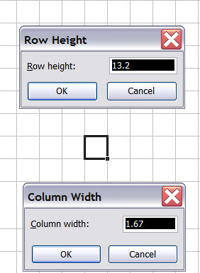
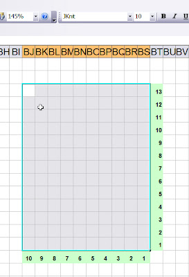
The next things you need are numbered rows and columns. Here’s where Excel’s formulas really shine. As you can see from the picture below, the right side and bottom of this chart have a colored bar where the row and column numbers reside. I filled the bars with a green background. Then I typed the number 1 in the appropriate row and column cells. You can see the neatly formatted numbers in the next screen shot.
Rather than laboriously typing in the rest of the numbers, I created a simple formula for Row 2 and Column 2, which is the contents of Row (or Column 1) +1. Then I cloned the formula into all the Row and Column cells. You can do this by copying and pasting or by dragging. Excel automatically creates the correct references. (I reiterate that you need a bit of spreadsheet knowledge to perform some of these steps).
Next, I formatted the contents of the chart itself to be all JKnit font by selecting the interior cells and choose JKnit from the Font drop-down list.
Now you are ready to begin.
There are three ways to enter symbols:
1. By printing a sample sheet of the font characters for reference and typing in the appropriate characters. You can do this by dowloading a font utility such as Font Viewer for the PC. I believe that Macs ship with a utility that can print sample sheets. Linux folks, you are on your own (sorry).
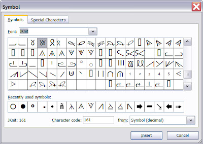
3.By using an On-Screen keyboard utility. In Windows, you will find this feature in the Start Menu, under Accessibility. (I don’t know if anything similar is available for other operating systems. )

A little typing, some nice borders, and you have a neat chart ready to go.
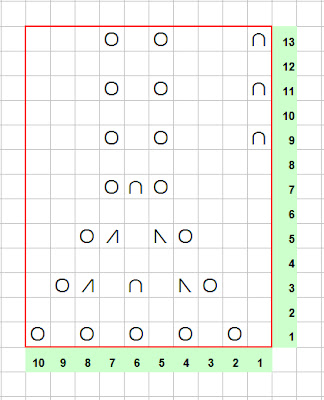
At this point, you will have to experiment. Neither of my fonts contain cable glyphs, because I don’t care for the look of cables, will never design for them, and hate to knit them as well. However, the fonts designed by David Xenakis and
Or, you may have to actually use Microsoft Word and type the symbols in, as suggested by David in his ReadMe file.
After you’ve created your chart, you can work with it in Excel, too. Just highlight the row you’re on and use the Up/Down keys to move backward or forward through the chart. Note that you can also load a picture into Excel as reference if you wish.
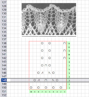
If you wish, you can transfer the pattern to your PDA and carry the pattern with you. Be aware that you might have to generate special fonts for your handheld to see the correct characters.
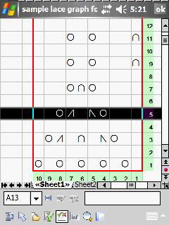
By the way, I use PlanMaker on my Axim handheld (that’s what this screen shot is showing), because Pocket Excel, a truly feeble excuse for a spreadsheet, strips out images. (My Linux PDA's spreadsheet program retains pictures.) Why Microsoft decided to remove this feature is another one of those Stupid Software Decisions that benefits the folks who make PlanMaker, and not anyone else.
You’ll see in another episode of this treatise, which is quickly approaching the size of an telephone book, why I want pictures to display inside of spreadsheets.
The next post will deal with other charting software. Next week, I hope.
Posted by
fleegle
at
5:33 PM
24
comments
![]()


